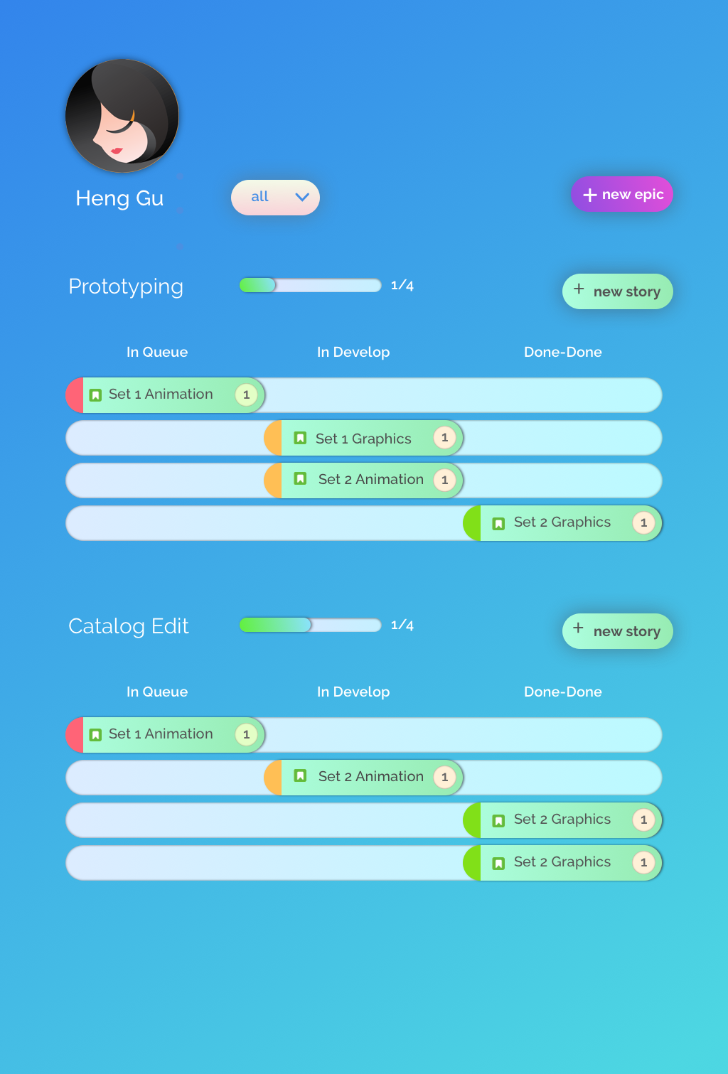
I love JIRA and hate JIRA at the same time. I love it because it is a very good project management tool. I hate it becasue I feel the UI is a little bit out dated which also makes the workflow a little bit difficult. I redesigned the UI and UX of JIRA. The goal is to make it more modern and clarify diffent elements of JIRA such as epic, story and sub-task. Also, trying to make it more engaging, I have implemented gamification features into the workflow.

Current JIRA
Reskinned JIRA
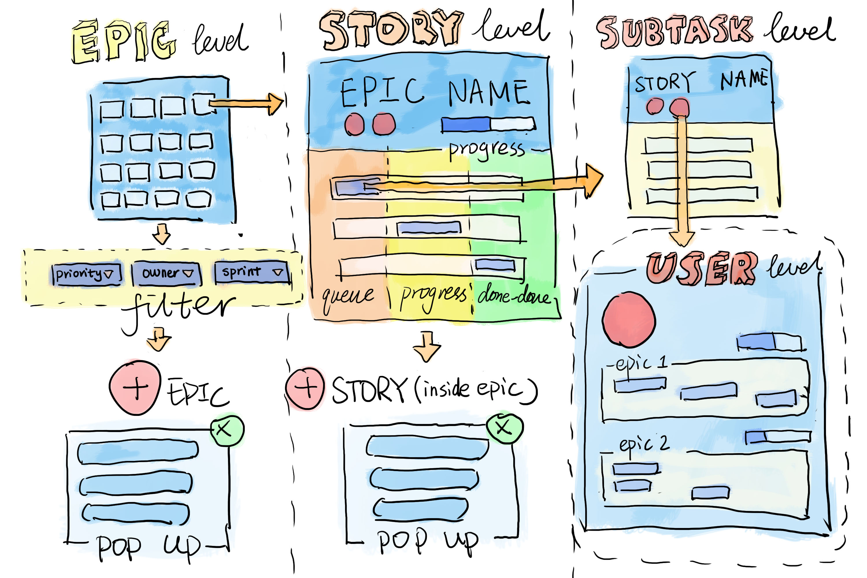
Easily filter the epics by priority, owners, and sprint.
Quickly change the statuses by just sliding the stories within an epic.
Check sub-tasks by clicking into a story.
Click into a profile to view epics and stories associated with that user.
Create epics directly from the sprint screen.
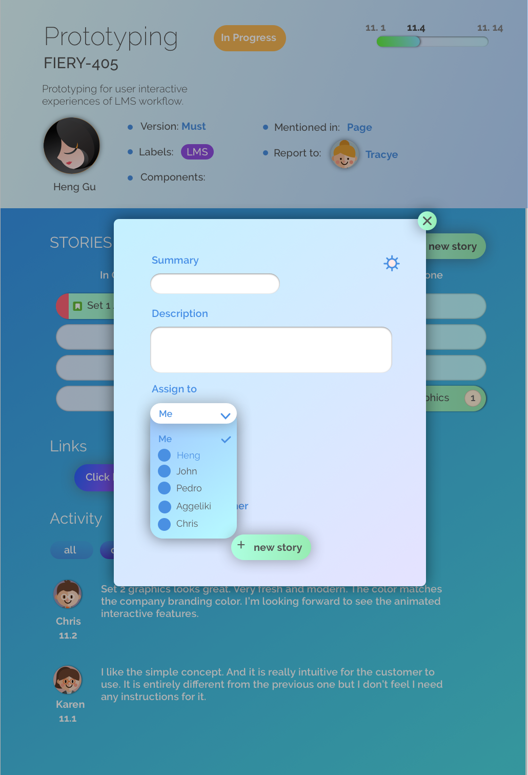
Create stories within an epic.
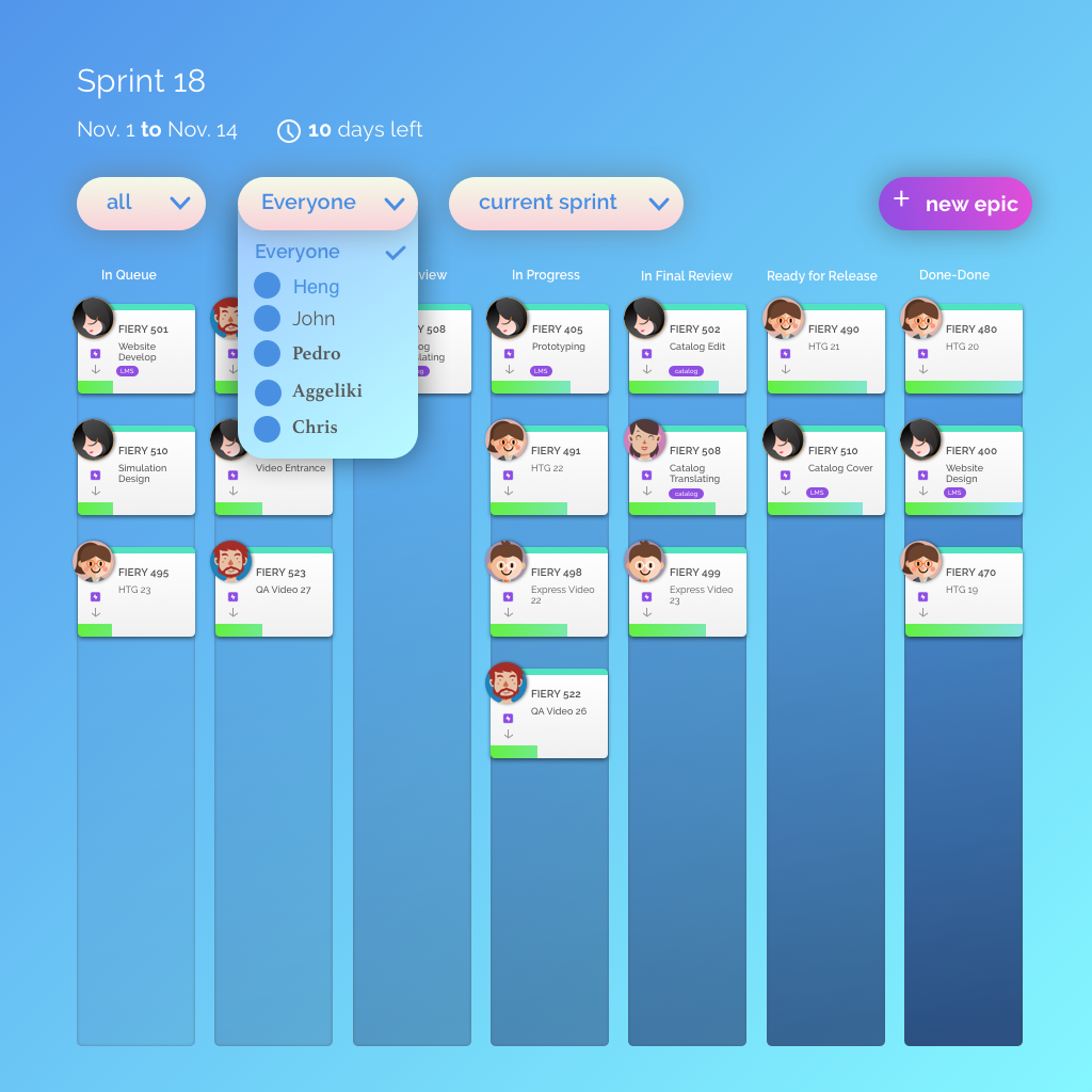
Using card concept to show owner, title, content and tags to represent epics with columns marking the status
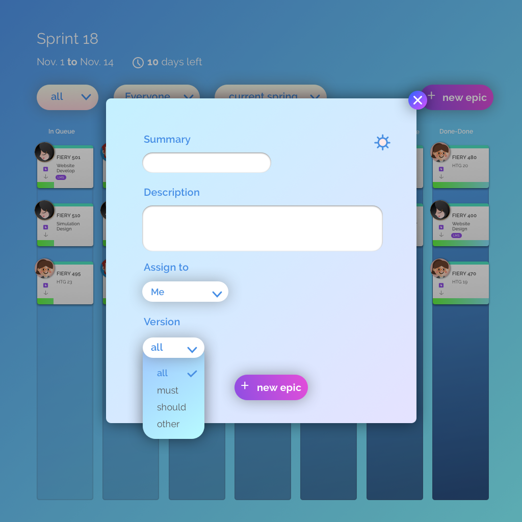
Create a new epic directly and quickly with a pop up window from the epic dashboard.
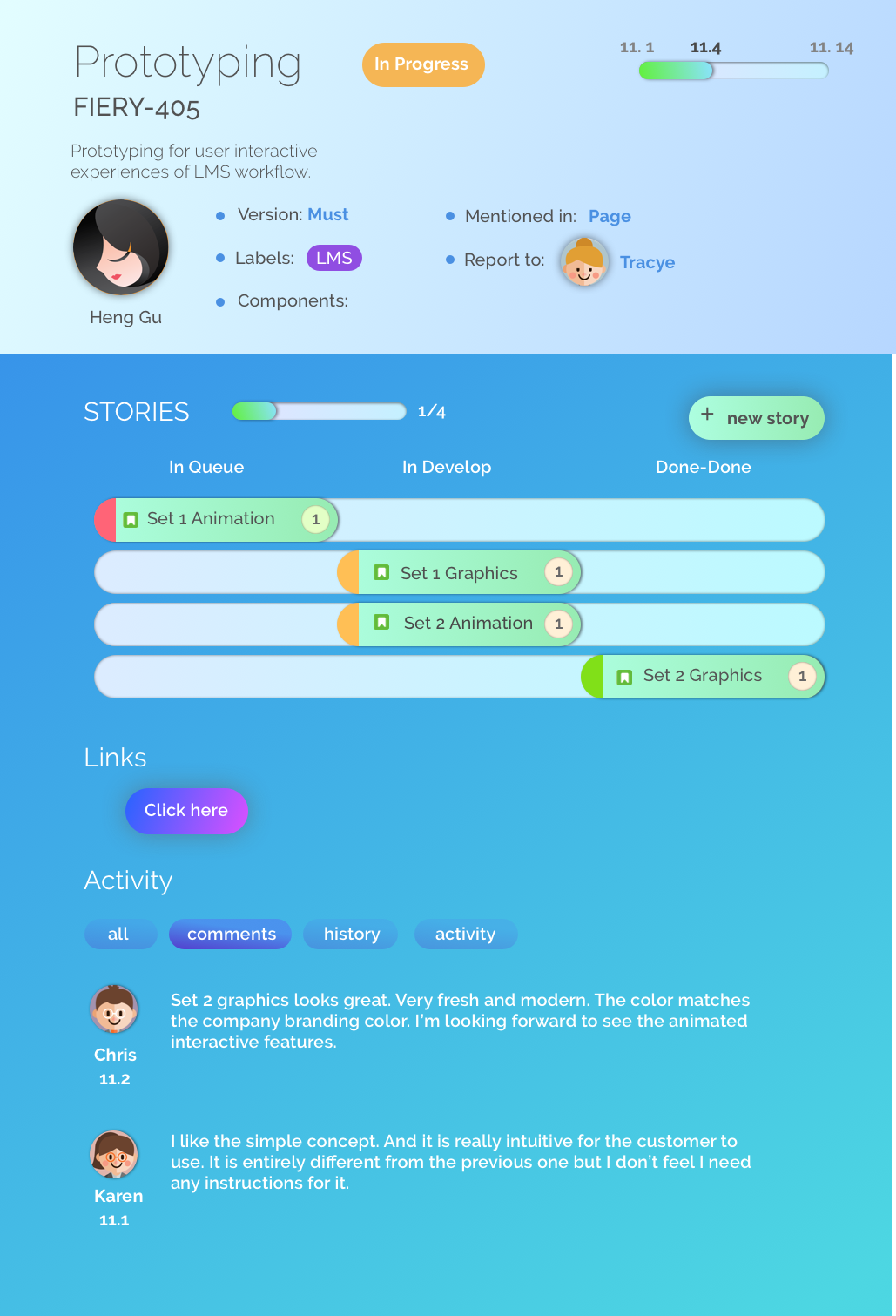
Show stories and progress associated with this epic in an illustrative way.
Create a new story directly from the pop up window within the epic.
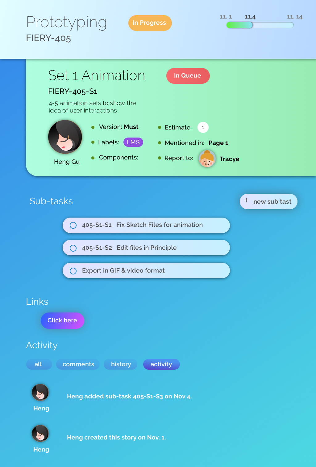
Epics, stories and subtasks have different ui so that they can be easily differentiated.
Browse by owner to see the epics and stories clearly and concisely.
